McCormick Red Cap Renovation
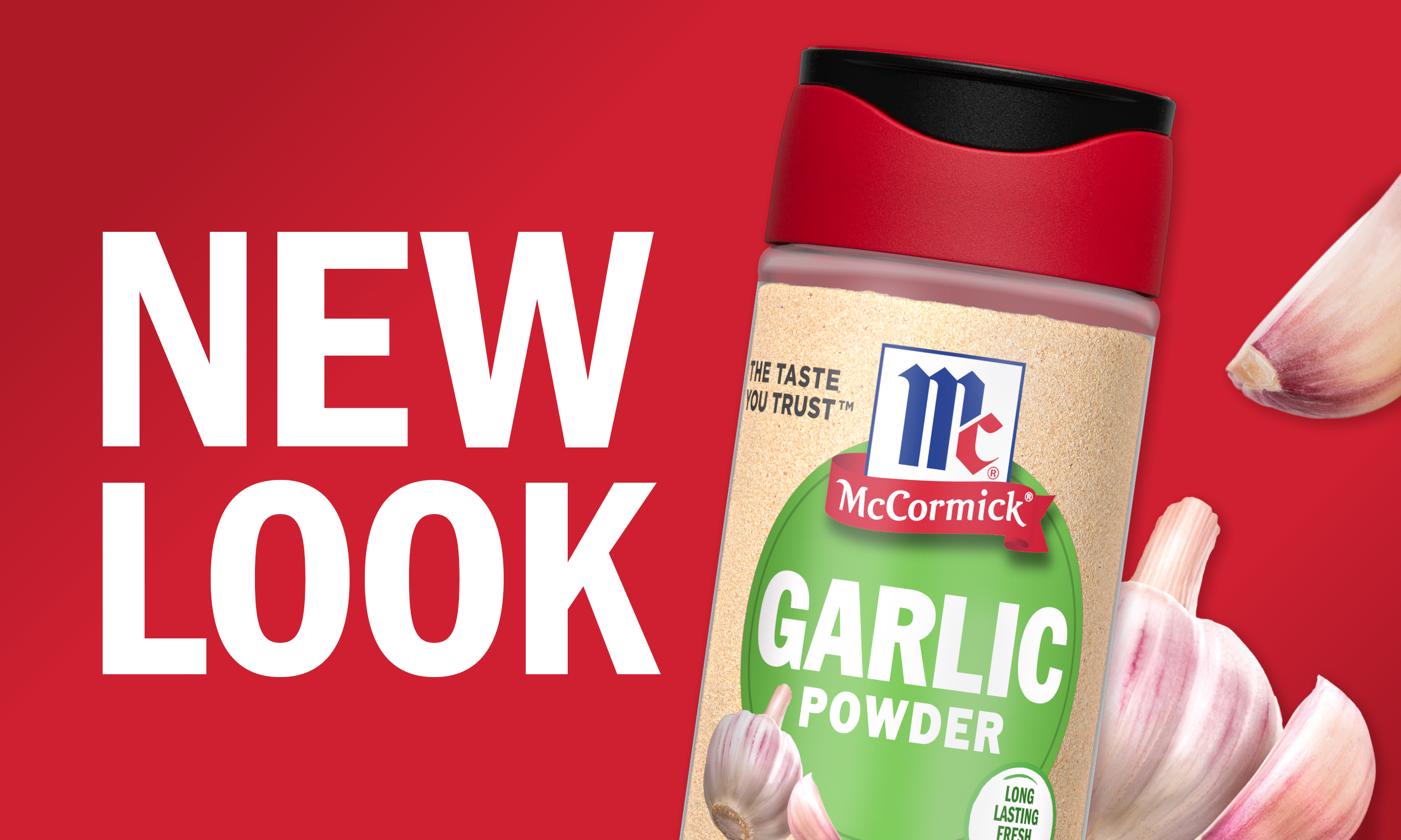
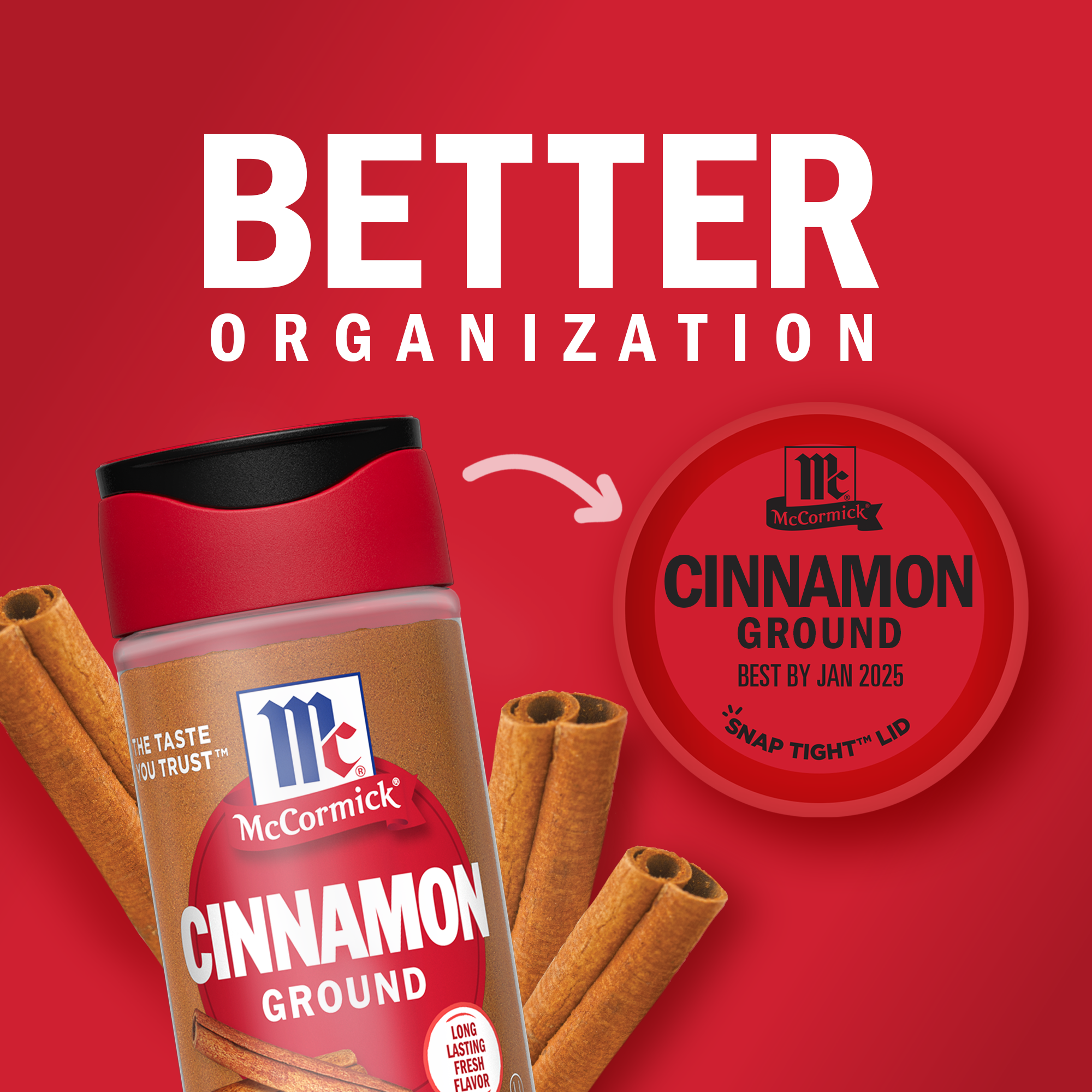
McCormick Red Cap Renovation – a fresh take on timeless flavor. In a world where quality and freshness reign supreme, McCormick embarked on a journey to redefine its signature red top packaging, a brand synonymous with the spice world. We recognized the need to embrace modernity while staying true to our heritage, striking a chord with younger consumers while retaining the trust of loyal spice enthusiasts. The result? A bold new design featuring the innovative 'SnapTight' cap, promising unrivaled freshness. We've adopted a clean, minimalist aesthetic with clear labels that allow our exceptional products to shine. The red dot with the product name and flavor cues take center stage, alongside our heritage tieing us to our roots. This revitalized look isn't just skin-deep – it's also eco-conscious, as our new packaging is crafted from 50% post-consumer plastic. Join us on a journey to discover how we breathed fresh life into our iconic red cap, securing a coveted place in today's spice cabinets and tomorrow's digital landscape.
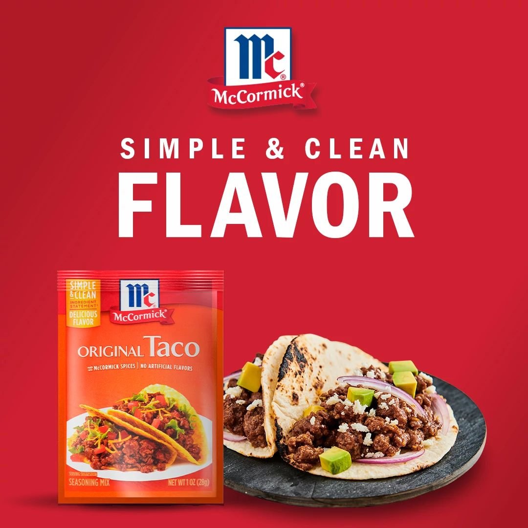
After playing a key role in the packaging renovation project, I had the privilege of spearheading the new look and feel for the red cap renovation launch campaign. We worked closely with our insights team to ensure our messaging would strike a chord with consumers while highlighting the advantages of the updated packaging. After multiple iterations, countless brainstorming sessions, and a compelling pitch, our in-house design direction emerged victorious, surpassing even the top agency concepts.
OVERVIEW
2023 GDUSA In-House Digital Design Award WinnerCOMPANY
McCormick & Company
ROLE
Creative Design Lead
TYPE
Digital & Campaign Design
C. DIRECTOR
Heather Gray

Old Look


New Look


ROLLOUT
With our established look and feel in place, we kicked off the creation of a plethora of dynamic digital assets. This phase allowed us to join forces with our exceptional in-house motion designers, crafting engaging content for social media and web platforms.


